Insifr – Islamic Banking App UX & UI Design
Insifr – Islamic Banking App UX & UI Design

Client
Insifr
Role
UX Researcher, Lead Product Designer, Product Manager
Industry
Fintech, Banking & Finance
Insirf is the first Islamic Banking app of the Netherlands, was created to address the gap in comprehensive financial management tools, particularly in banking services.
Recognizing the need for a centralized platform, the founder developed a mobile application that streamlines banking activities and provides actionable insights to optimize financial decisions.
Results and Outcome
- A fully designed Web & Mobile app
- A redesigned mobile application
Scope
- The scope can be divided into two parts: web and mobile app.
- The web version needed a range of features designed (a dashboard, account creation journey, etc). On the other hand, the mobile version needed a full feature set design.
02 - Discovery

Kick-off Call
The client had too many uncertainties about the scope of the product, what features to include, the business model, etc. We agreed to begin researching the market to help come up with ideas and asked the client to provide us with all the information they had to help speed up this process

Lightning Decision Jam

Desk Research

Alex Rodrigo
Age
26
Marital Status
Single
Location
Amsterdam
About
- A freelance designer, who travels the world
- His lifestyle requires efficient finance banking apps to handle earnings in various currencies.
Goals
- Manage and track earnings.
- Gain real-time insights on spending patterns & budget.
- Simplify financial stuff.
Pain Points
- Manually manage & tracking earnings.
- To manage multiple currencies in one place is a hassle.
03 - Ideation Workshops
Ideation Workshops
In this workshop, we presented to the client the Discovery Results and proposed an exercise to generate the main solution hypothesis to be validated by this project. We were able to align three main hypotheses for each user need (refined after concluding the discovery phase).
Then we conducted a sketching exercise to come up with ideas on how to implement those hypotheses. This was very interesting as the client did it before. We also participated and were able to select the main direction of the solution, for us to use as a reference next when building the first concepts
the Ideation canvas
Information Architecture
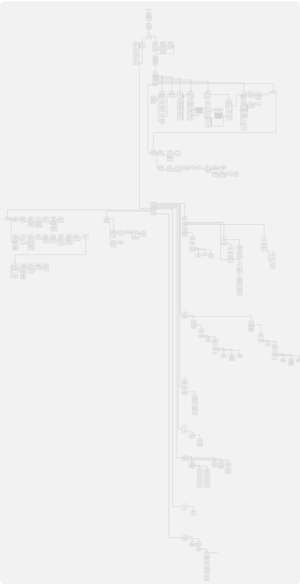
During ideation phase, we started working on the Information Architecture of the application, based on the main ideas generated. The work consisted of proposing a navigation structure through a product map and layout options based on the map. We also proposed a user flow for the first part of the new user experience, the setup of the account, through a series of steps to collect the necessary data to present users in the app.
User Information Architecture
Business Information Architecture
Gathering Requirements

Conducting a UX Workshop
In order to get on the same page on the key aspects of product design, such as success criteria, team structure, and product vision, we’ve conducted a UX workshop.
Before moving on to wireframes, we’ve identified our key design priorities, which included:
- Building trust. Pricing suggestions generated by AI are very likely to raise eyebrows among our users. Therefore, it was our priority to demonstrate how AI works.
- Making app usage intuitive.
- Setting the right expectations. As potent as AI is, it needs time to aggregate data. Thus, users shouldn’t expect the app to perfectly optimize their prices on the first day.
Below, you can see the solutions we’ve brainstormed to the aforementioned challenges.
feature set on under side
we create innovative features for seamless islamic banking on insifr app
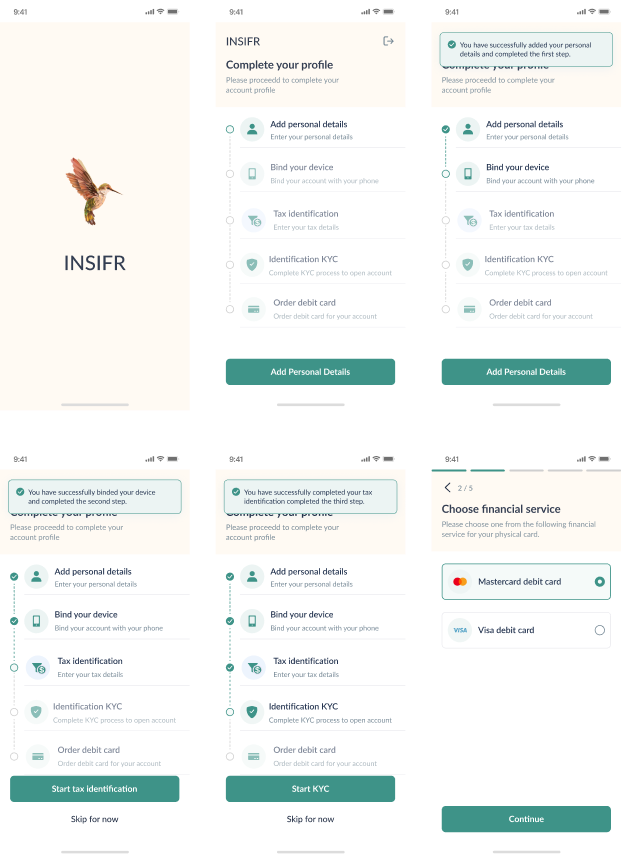
account creation journey
- onboarding
- personal details
- bind your device
- tax identification
- KYC
- Order debit card
Digital banking
- home page
- bucket
- add money
- transfer
- schedule
- via cash
- exchange
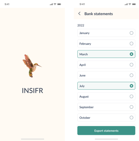
- bank statement

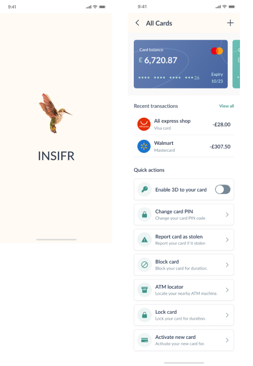
Card Feature
- home page
- Cards Transactions
insights
- home page
- insights
investment
- home page
- investment

insurance
- home page
- Insurance

Landing
- home page
- Landing

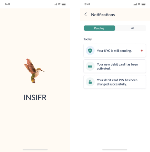
Notification
- home page
- Notification
Settings
- home page
- Settings

feature set on under side
account creation journey
- onboarding
- Add Business Details
- Upload Document
- Legal Representative
- Beneficiary Owner
- Tax Identification
- Identification BKYC
- Order debit card

Digital banking
- home page
- Add Money
- accounts
- transfer
- schedule
- exchange
- bucket
- bank statement

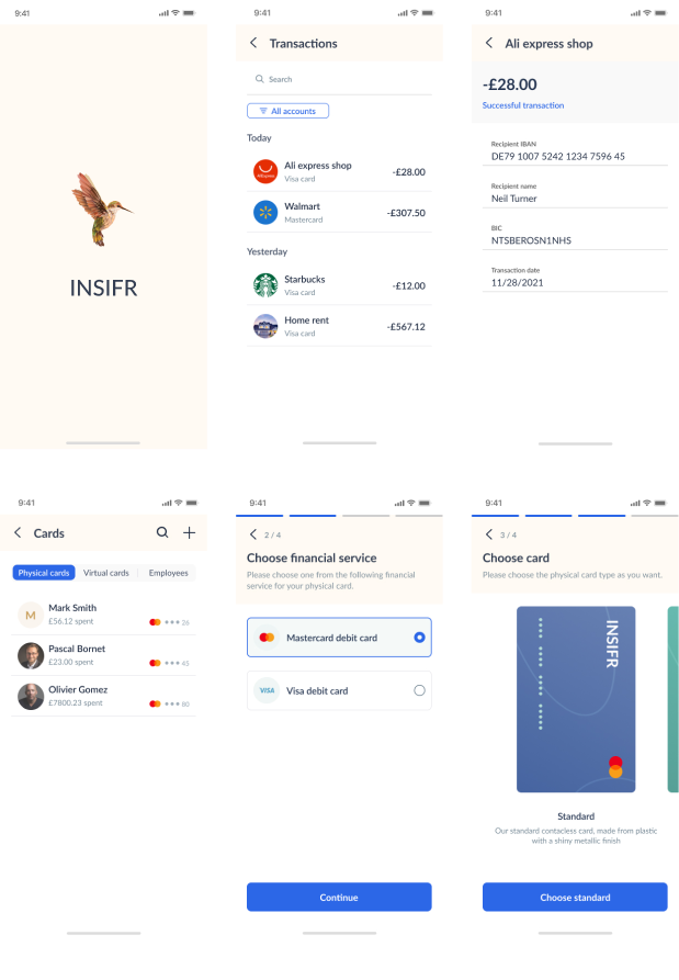
Card Feature
- home page
- Cards
- Transactions
insights
- home page
- insights

investment
- home page
- investment

insurance
- home page
- insurance

notification
- home page
- notification

subscriptions
- home page
- subscriptions

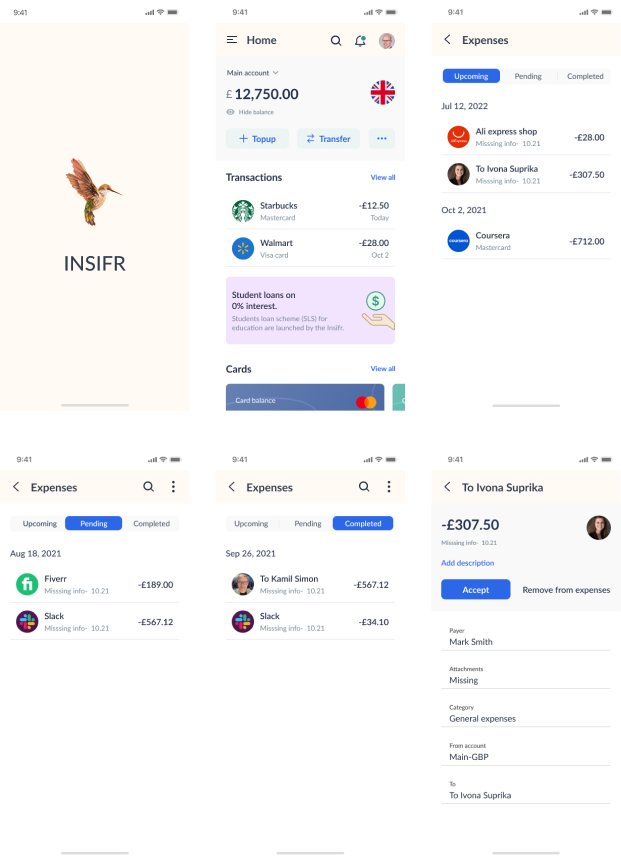
expenses
- home page
- expenses
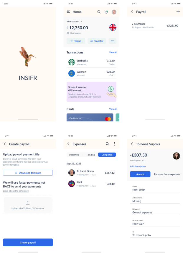
payroll
- home page
- payroll
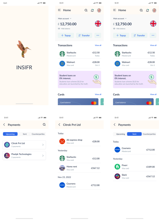
payments
- home page
- payments
Settings
- home page
- Settings

03 - UX Research
Lo-fi wireframes
Web-app Single

Web-app Business

Mobile Single

Mobile Business

05 - Visual Design
Visual Style Guide
In parallel to our work on the user research we also worked on the mood board. We conducted an exercise to determine the visual and communication attributes, to use as a guide to reaching the appropriate Look & Feel. Then we asked the client to provide us with references to using as inspiration, adding to the ones that we had already collected.
Last we proposed a few different versions, settling on one that was used to turn the low-fidelity wireframes into high-fidelity.
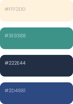
Color Scheme

Typography

06 - Persons
Mobile App - Person


Web App - Person


06 - Business
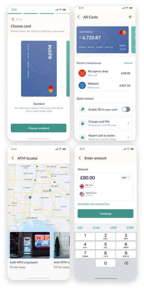
Mobile App - Business

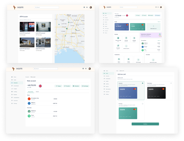
Web App - Business

Let's make your brand brilliant!
Do want to improve usability in your product?
If you would like to work with us or just want to get in touch, we’d love to hear from you!
- hello@wireframebuddy.com
- USA
307 W 38th St
16th Floor 302
New York, NY 10018
- Germany
Neue Schönhauser Straße 3
Berlin, BE 10178
