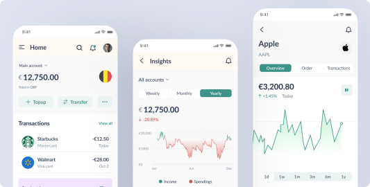
Hysab Kytab Karobar – SME Finance Management App
Hysab Kytab Karobar – SME Finance Management App

Client
Hysab Kytab, Pakistan
Role
UX Designer, Product Designer, Product Manager
Industry
Fintech, Personal Finance
The Hysab Kitab app simplifies financial management for individuals and small businesses. It offers intuitive tools for expense tracking, budgeting, and expense sharing, empowering users to make informed financial decisions and achieve financial stability.
Overall, the Hysab Kitab app provides a convenient and user-friendly platform for individuals and small businesses to achieve financial stability and effectively manage their money.
Results and Outcome
- A significant increase in awareness of spending habits and overall financial health.
- Improvement in budgeting skills, reduced overspending, increased savings, and overall better financial management.
Scope
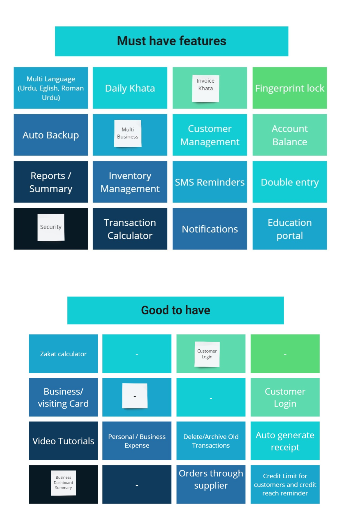
- Identify essential features.
- Define features in detail.
- Develop user stories based on SME feedback.
- Facilitate grooming sessions with the development team for feature refinement and handoff.
Project length
02 - Discovery

Competitive Analysis


User Survey
Target Audience

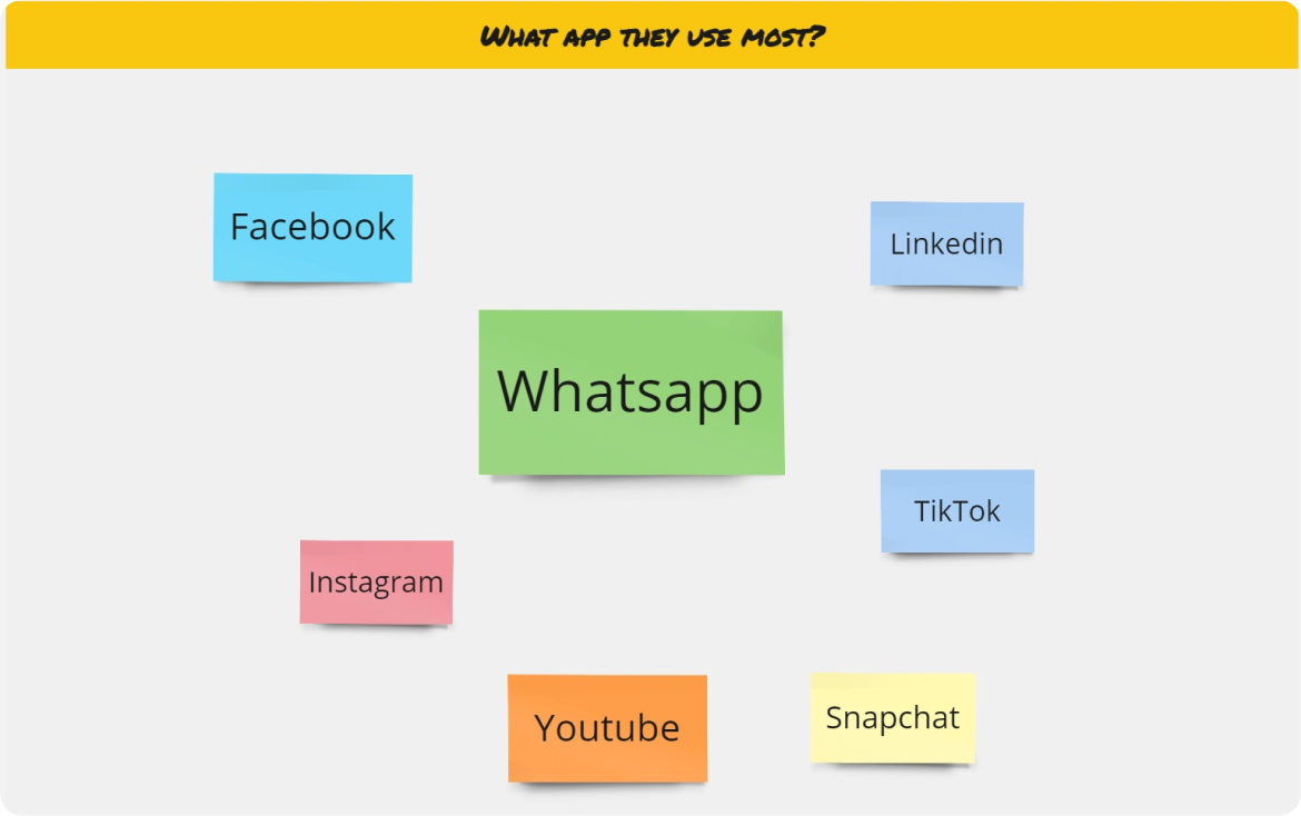
What App they use most?
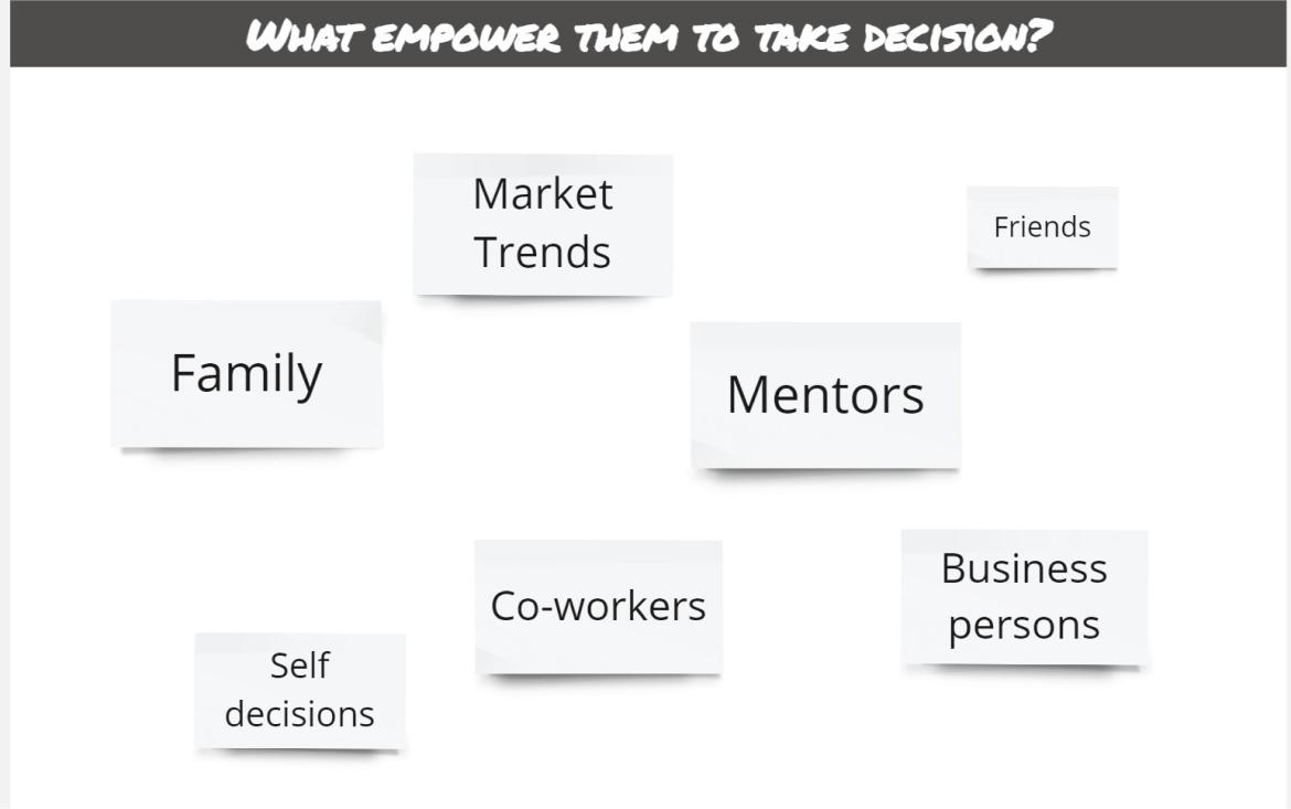
Their Decision Making
Through user surveys, we inquire about the methods users employ to empower their business decisions.
Direct & Indirect Competitors

Findings

Findings
Information Architecture

03 - Ideation Workshops
Ideation Workshops
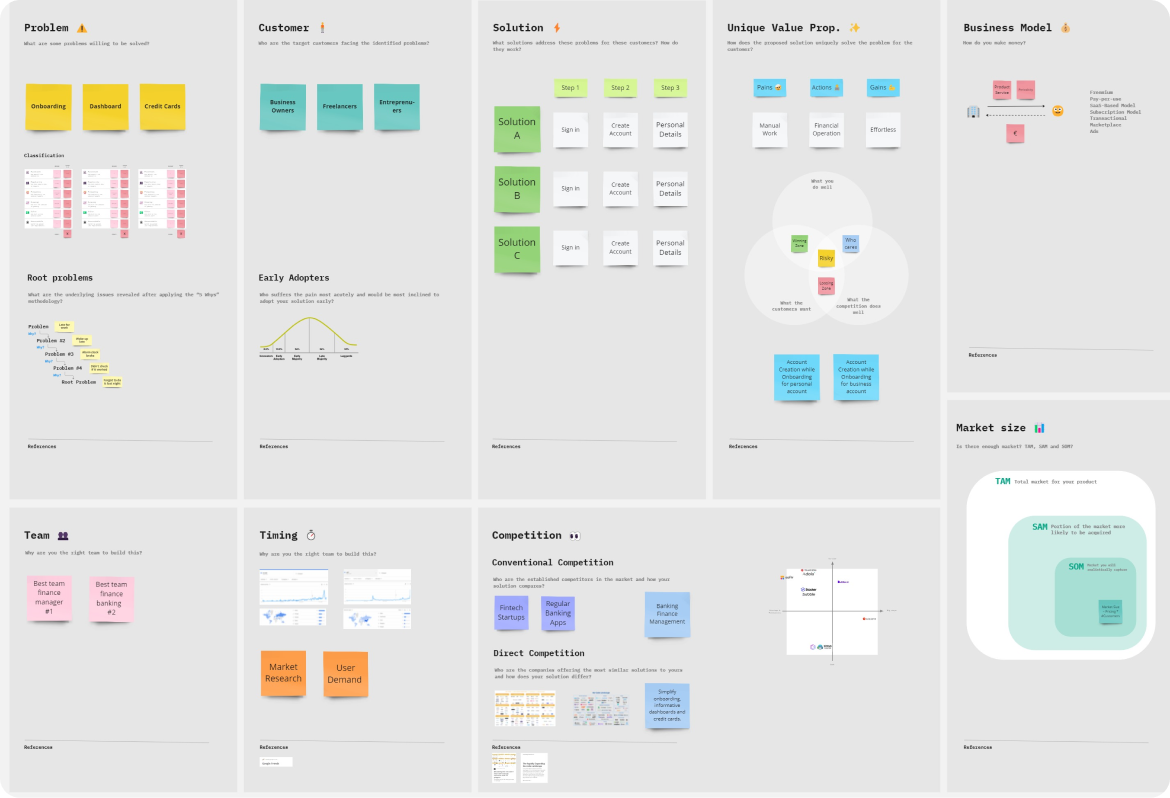
In this workshop, we presented to the client the Discovery Results and proposed an exercise to generate the main solution hypothesis to be validated by this project. We were able to align three main hypotheses for each user need (refined after concluding the discovery phase).
Then we conducted a sketching exercise to come up with ideas on how to implement those hypotheses. This was very interesting as the client did it before. We also participated and were able to select the main direction of the solution, for us to use as a reference next when building the first concepts
the Ideation canvas
Feature Exploration
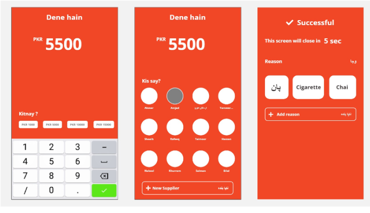
The feature is designed to minimize clicks and user interaction, effortlessly record
entries and manage business finances with ease and efficiency.
From Lending Money
Seamlessly lend money and keep your goals in sight, managing loans instantly anytime.

To Borrowing Money
Summary
After testing with users, we discovered that many retailers prefer not to record every transaction, focusing instead on recurring client transactions due to the credit they extend and the long-standing history with customers. Additionally, they expressed a need to track purchases from wholesalers and maintain credit records with them.
In response, we’ve initiated research on a new feature: The Customer and Retailer Credibility Checker. This feature involves cross-sharing user data between different retailers and wholesalers and is currently in the research phase, with ongoing surveys to inform its development.
04 - UX Research
Lo-fi Wireframes
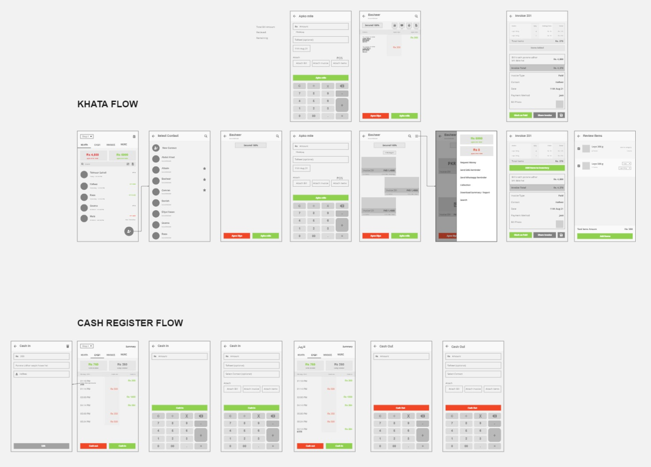
After having the concepts for navigation ready, we focused on building a low-fidelity prototype of the main user flows. The main ideas were already proposed in the ideation sessions, but the IA study helped to shape the navigation and integrate the parts better.
The process of wireframing in low fidelity involved a few sessions of feedback with the client, showing the prototypes, and making adjustments until we had something that was somewhat ready to be tested.
05 - Design System
Design System
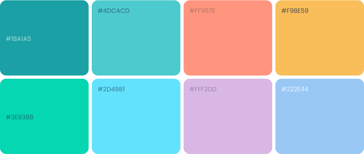
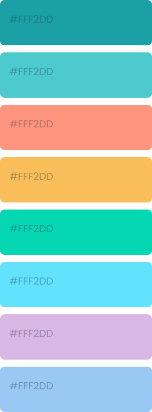
In parallel to our work on the user research we also worked on the mood board. We conducted an exercise to determine the visual and communication attributes, to use as a guide to reaching the appropriate Look & Feel. Then we asked the client to provide us with references to using as inspiration, adding to the ones that we had already collected.
Last we proposed a few different versions, settling on one that was used to turn the low-fidelity wireframes into high-fidelity.
Typography

06 - Final Design
High-Fi Wireframes
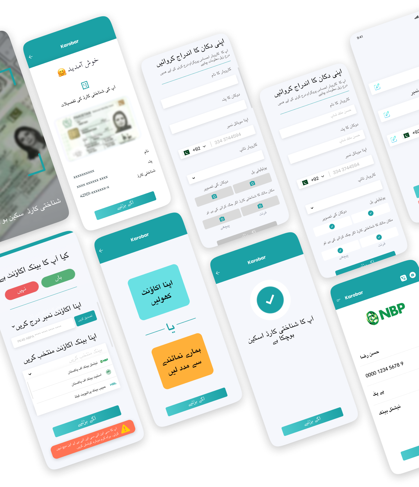
During final design phase, we work to finalize prototypes, making final adjustments, and creating a navigational prototype so the client could use it to present to possible investors.

Let's make your brand brilliant!
Do want to improve usability in your product?
If you would like to work with us or just want to get in touch, we’d love to hear from you!
- hello@wireframebuddy.com
- USA
307 W 38th St
16th Floor 302
New York, NY 10018
- Germany
Neue Schönhauser Straße 3
Berlin, BE 10178
Branding
Product Design
Finance Banking App
Branding
Product Design
Merchant UX App

