Modal Merchant – Conversational AI Management Platform
Modal Merchant – Conversational AI Management Platform
Client
Robert Empson
Role
UX Designer, Product Designer
Industry
Artificial Intelligence
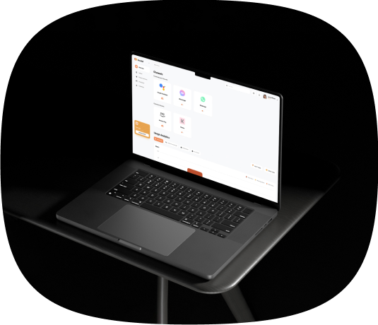
MODAL is a B2B SaaS platform to streamline conversational commerce for brands. This platform allows easy setup and management of channels like Alexa, WhatsApp, Facebook Messenger, and Google Assistant from one place.
Training conversational Al can be complex, especially for diverse user journeys. MODAL simplifies this with a
product that lets brands effortlessly create and manage dialogs, product inventories, and Al campaign scripts.
Our user-friendly platform supports collaboration among four types of users and offers clear, reliable analytics, enabling brands to optimize their conversational commerce strategies effectively.
Results and Outcome
- Brands can manage multiple conversational commerce channels from one platform.
- The platform simplifies training Al for diverse user journeys, enabling easy creation and management of dialogs, product inventories, and Al scripts.
- Leveraging the platform gives brands a competitive edge in the conversational commerce landscape, driving business growth.
The final UX design meets all our requirements and looks great. The team is efficient and to the point, impressively able to understand design needs and integrate feedback.
02 - Discovery

User Research

Use Cases
Use cases are essential as they clarify real-world product usage, guiding design and development to meet user needs. They align stakeholders, mitigate risks by identifying issues early, and support thorough testing. Additionally, use cases enhance user experience and provide valuable examples for marketing and communication.
Information Architecture
02 - Ideation Workshops
02 - Discovery
In this workshop, we presented to the client the Discovery Results and proposed an exercise to generate the main solution hypothesis to be validated by this project. We were able to align three main hypotheses for each user need (refined after concluding the discovery phase).
Then we conducted a sketching exercise to come up with ideas on how to implement those hypotheses. This was very interesting as the client did it before. We also participated and were able to select the main direction of the solution, for us to use as a reference next when building the first concepts
03 - UX Research
Lo-fi Wireframes
After having the concepts for navigation ready, we focused on building a low-fidelity prototype of the main user flows. The main ideas were already proposed in the ideation sessions, but the IA study helped to shape the navigation and integrate the parts better.
The process of wireframing in low fidelity involved a few sessions of feedback with the client, showing the prototypes, and making adjustments until we had something that was somewhat ready to be tested.
User case 1 - manager
User case 2 - executor
User case 3 - analyst
User case 4 - solution architect
04 - Design System
Design System
After having the concepts for navigation ready, we focused on building a low-fidelity prototype of the main user flows. The main ideas were already proposed in the ideation sessions, but the IA study helped to shape the navigation and integrate the parts better.
The process of wireframing in low fidelity involved a few sessions of feedback with the client, showing the prototypes, and making adjustments until we had something that was somewhat ready to be tested.
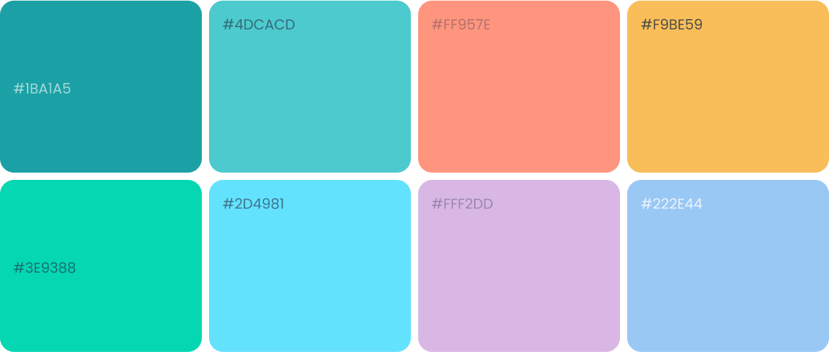
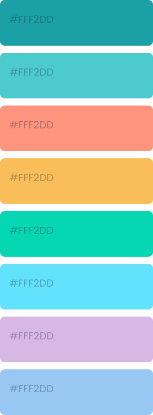
Color Scheme
Typography

site map
components library
06 - Final Design
High-Fi Wireframes
During final design phase, we work to finalize prototypes, making final adjustments, and creating a navigational prototype so the client could use it to present to possible investors.

Let's make your brand brilliant!
Do want to improve usability in your product?
If you would like to work with us or just want to get in touch, we’d love to hear from you!
- hello@wireframebuddy.com
- USA
307 W 38th St
16th Floor 302
New York, NY 10018
- Germany
Neue Schönhauser Straße 3
Berlin, BE 10178
Branding
Product Design
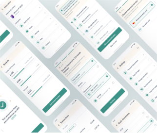
Finance Banking App
Branding
Product Design
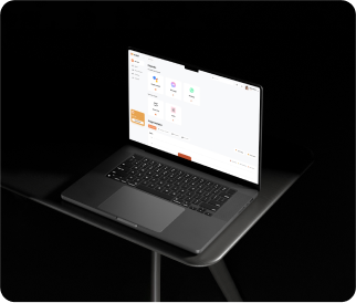
Merchant UX App

